FashionGo Dropshipping
Project Background:
FashionGo Dropshipping is a B2B e-commerce platform, hosted on Shopify, dedicated to fashion and lifestyle products. It serves 7,000 sellers and attracts 500,000 potential buyers.
Responsibility
Led the end-to-end UX design process, including the creation of high-fidelity wireframes and mock-ups.
Focused on optimizing the order experience across three desktop applications (admin, buyer, and seller), as well as a mobile app for buyers
Team
UX Director: 1
UX Designer: 1
Developer: 1
Business Team
Dropshipping is an e-commerce business model that allows buyers to sell the products without dealing with inventories nor purchasing products in advance unlike traditional retail process. Dropshipping service offers buyers displaying products on their online store and when consumer orders them, suppliers directly sends products to the consumer.
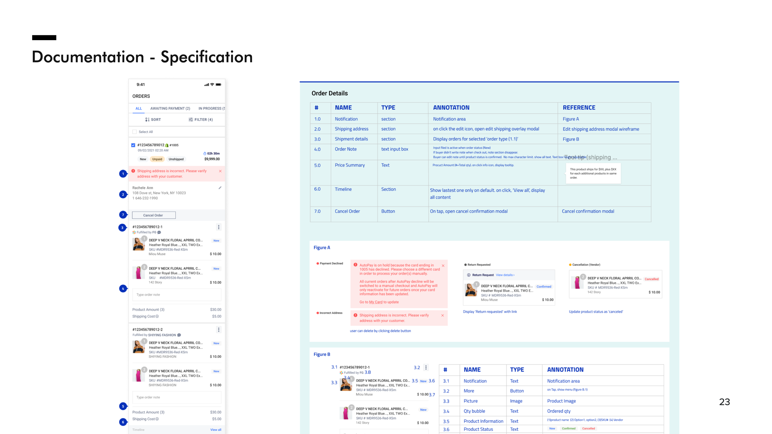
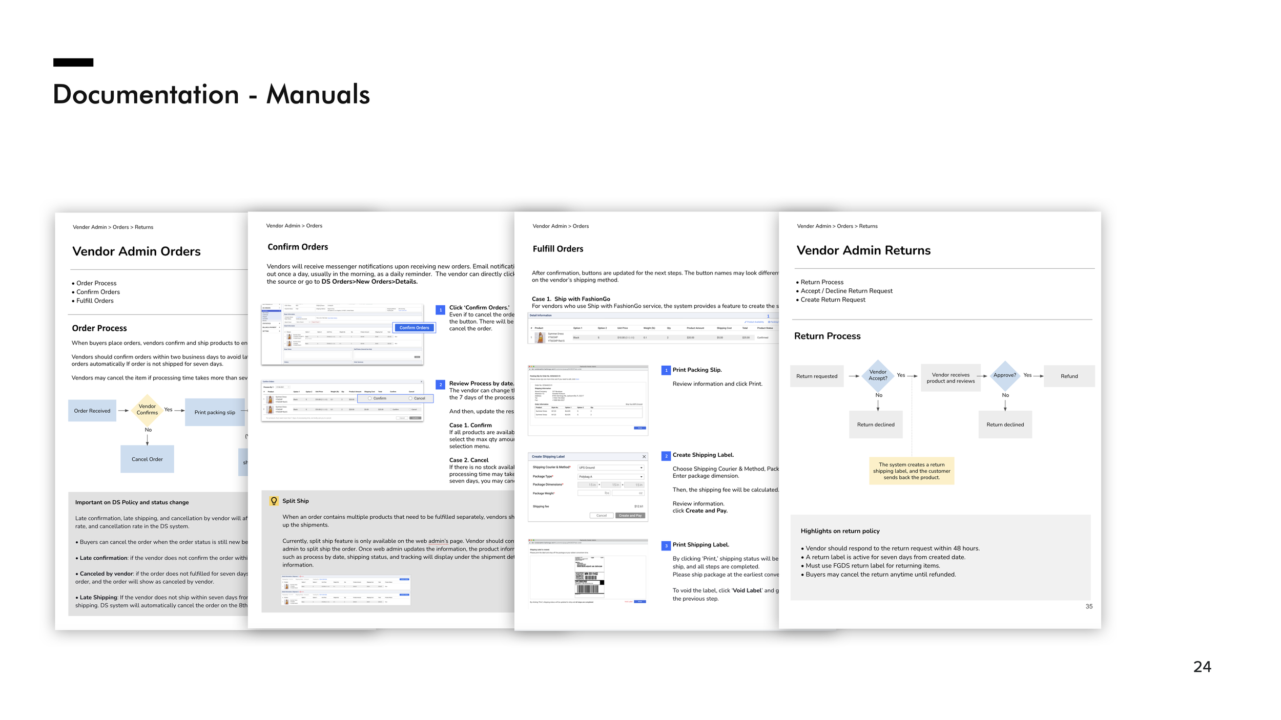
I proactively initiated the process of comprehending our order system, considering the complexity of our business model. In addition to the standard dropshipping service, our business also integrates the company's delivery service, similar to Amazon Prime, and manages its own returns process. Given these intricacies, it became imperative to gain a comprehensive understanding of our business operations and features. To achieve this, I undertook the task of visually mapping out the system flow, facilitating alignment and collaboration with other team members.


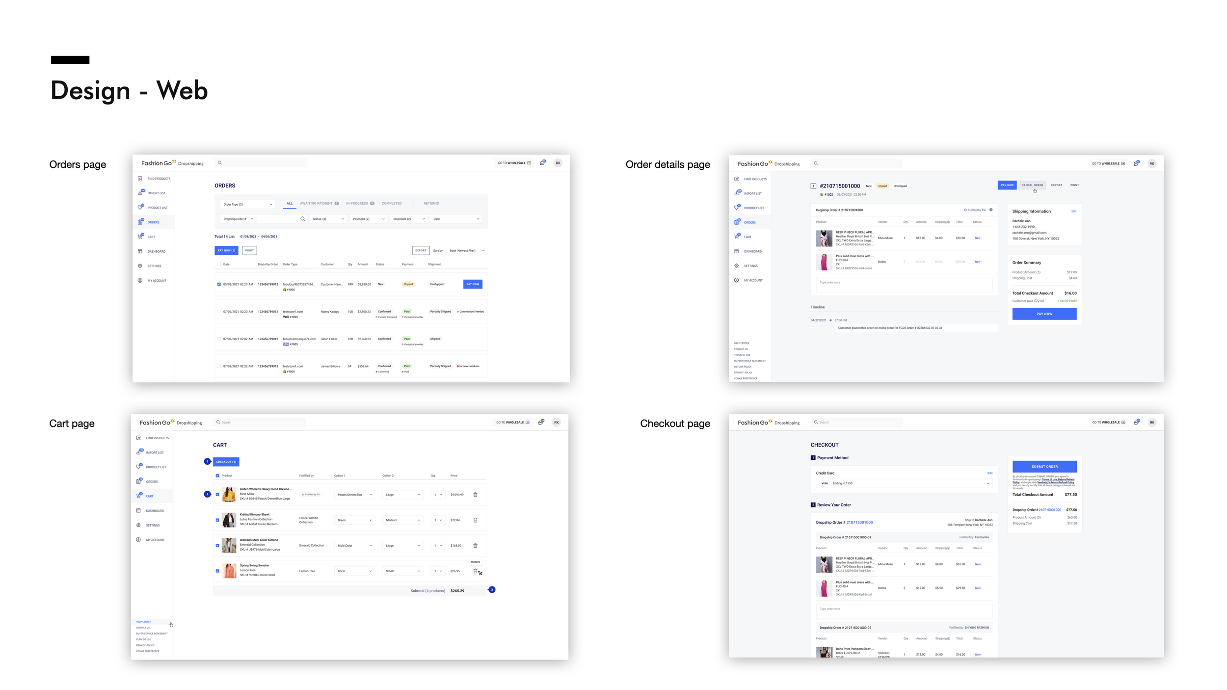
After conducting competitor research, I swiftly transitioned to the design process with a specific focus on the order pages. My primary responsibility was to design these pages in a way that offered users a clear and intuitive navigation structure for easy payment and order tracking.
To achieve this, I positioned the order categories prominently in the header area, ensuring that users could easily access the categories they needed the most. The numbers displayed next to each category indicated the number of orders requiring user actions. Additionally, I implemented filters below to allow users to search for orders efficiently within these categories.
To streamline the payment process, we introduced a multi-payment feature on the list page, offering users convenient bulk payment options. Users can initiate payments directly from this page, leading them to the checkout page. Additionally, for a more detailed view, users can click on individual list items to access the details page.
The order details page is organized into distinct containers for easy navigation. At the top, users can find essential information such as the parent order number and order status, accompanied by primary action buttons conveniently positioned on the right side.
Below, order details are grouped by fulfilling vendor in separate containers, enhancing clarity and organization. A split-panel display effectively presents both customer shipping information and order summary side by side.
To facilitate the payment process, a 'Pay Now' button is prominently displayed, guiding users to complete their payments efficiently.


Results
As of February 2022, we launched a promotional site to promote our upcoming dropshipping app. On the site, we provided an email subscription option to gauge users' interest and collect samples for beta site testing. We received overwhelmingly positive responses, with over 5,000 users signing up and expressing interest in becoming our customers. Since the app's launch, it has received a 4.1-star rating with positive reviews about the transaction experience.


